- The expected elements that will be included in products from particular media forms & genres
Modern adverts often make references to other. media products, perhaps from other media form or genres, that audiences can identify
- many early 20th century adverts were found in newspapers
- they were small and emphasis was on the text with only simple line illustrations
- they were often black and white or with just one added colour
women were sexually objectified
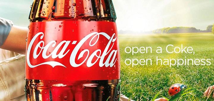
slogans are litteral
the colour palette matches the bottle
coke is repetitive
the women are playing tennis
can see the actual product
narrative:
when the women is tired she can go and get a coke and she come back to the game all refreshed
while of brand
traditional gender roles
stereotypical
Wednesday 10th January 2024
Do now:
what are your first impressions about the three main people in this advert?
the two girls are using him, the man is wealthy because of the gold rim around the picture, the suit, the over flow of sweets
what kind of lifestyle do they lead? How do you know?
rich, wealthy lifestyle, luxurious
What messages do you think Quality Street is trying to portray about their product?
to portray the brand as a luxurious brand
Historical advert set text
L/O: To explore the context & representations in the historical set text.
- the 1950s saw a change in "high culture",where entertainment and arts became more accessible and affordable for everyone.
- the post war culture of strict rationing and state control was coming to an end and the new government set to increase individual freedom
- people could afford more luxury items (big tins of sweets)
dilemma means problem
that women like hoovering
are expected to look after the family home whiles the husbands are at work
the advert is aimed at men buying hoovers as gifts for their wives
advert 2:
that wives are expected to cook for their husbands
aimed at men buying their wives cooking supplies
advert 3:
the husband/ dad is sitting on a chair
the wife/mother is cleaning
the boy is playing with a toy plane
the colour of the clothes that the family is wearing matches the ice cream and bowl
advert 4:
should stay at home
that women should stay under the mens success
advert 5;
the women should do everything for the men
advert 6:
that some men are alcoholics
the men have more power then women
the men looks smartly dressed whiles the women stay at home
the gender roles in the 50s were very traditional. the women were seen as stay at home mothers who looked after their family homes and husbands instead of themselves, the 50s was a time were men were seen as more powerful then the women, by working and wearing smart clothing
how can we see the gender roles of the 50s in this advert?
because the men are more powerful & successful they can get away with cheating
the women are getting objectified
The man is framed in the centre of the advert, controlling the situation
effect: that he's more powerful than the women
The man is looking down at his lap where the product, he is holding is purposefully placed. this is a 'phallic' symbol
effect: that men are dirty pigs
The man's costume is a suit which has connotations of the modern businessman.
effect: shows that he is powerful and successful
The women in the advert are both dressed like the sweets and kissing the man as they reach towards the chocolate tin in his lap...
effect: the women were objectified in the 1950s
Friday 12th January 2024Do now:
which gender is dominant in the Quality street advert?
male
Give three reasons why you have chosen this gender
- the man's costume is a suit which could mean he's a business man
- the man is framed in the centre of the advert, controlling the situation
- the women in the advert are both kissing the man
Historical Advert set text
L/O: To explore the possible exam style Questions for Advertising
the product itself was designed and planned for working families and the imagery is very aspirational of a higher class which links to post-war era.
In the Quality street advert the male is dominant, this is shown were the man is framed in the centre of the advert, controlling the situation.Another reason is the man's costume is a suit which has connotations of the modern business man. As for the women, women are lower class than the male this is shown by their choose of clothing, it was also shown in the 1950s that most women were objectified, in the quality street advert the objectification was that the two women are representing the sweets that are being showed in the advert.The male gaze theory is the way in which the visual arts and literature depict the world and women from a masculine point of view, presenting women as objects of male pleasure, it was coined by feminist film critic Laura Mulvey in 1975.
HOMEWORK!!
In the Quality street advert the man is sitting in the centre which could represent his importance and that he is dominant, he is also wearing a business suit which could connote that he is a higher class with a professional job.
In the advert the women who are kissing the man on the cheeks are being objectified this is shown by their clothing the clothing are the same colours as the sweets that are being shown, the women could be representing the sweets that the man has an option to pick only one.
The characters in the gold frame, Miss Sweetly and Major Quality, are part of the brand identity of the product since 1936. The characters are symbolic of the Regency era of British history referenced by the dress codes of the characters in the gold framed picture at the back of the advert.
The historical and political definition of the Regency is the period from 1811 to 1820 when George, Prince of Wales, governed the country as 'Regent' during the madness of his father George III. The decision to bestow the Regency on George was not taken lightly.
The two female characters appear to be of a lower class than the man in the suit, and the man in the suit is of a lower class than the two characters in the gold frame. the item that brings all these classes together is the product in the centre of the image.
The historical representations of the regency characters typical show feminine colours, and the showing of flesh for Mrs sweetly, and the formal uniform dress of Major Quality signify importance and power in their own relationship.
Wednesday 17th January 2024
Analysing Adverts
L/O: to build the skills needed to analyse and evaluate adverts
DO NOW:
connotation:where your describing an object that has a deeper meaning ( the man is wearing a suit which could show he has a professional job and that he is high class)
connotation: is what you associate with it
Denotation:an object with a literal meaning
Denotation: is what something is
Advert 1:
the solider's could be protecting the broadband
the soldiers is related to London/uk (stereotypical)
the yellow and blue are neon have connotations of technology
advert 2:
the big mac is supposed to be something special not just a burger?
the big mac is supposed to be a woman 'stop staring at me like i'm some piece of meat
its like a women talking to a man
dimension different types of food in the burger
are you mac enough? - are you man enough?
Mcdonalds, big-mac
brand recognition
in a bed, luxury, passion, romance
advert 3:
reused cars
cars being improved (from 1909)
no.1 they are the best
race cars shown red and yellow
race cars = speeds
advert 4:
band aids are strong like hulk
there flexible for big fingers
the box is smaller than the hand
positive:
interested, curious, disabled, inquisitive
negative:
nosy, crippled, handicapped, retarded
Wednesday 24th January 2024
Gender stereotypes
list all the stereotypes you can think of for males & females
- all males watch football
- blue is considered as a boys colour
- pink is considered as a girls colour
- male are more dominant than the women
- all women are feminine
- women are weak
Contemporary Adverts
L/O:to understand the techniques used in contemporary adverts
how do the two adverts conform to gender stereotypes?
the advert with the women sitting on the car the main cover line was ' life's too short to wear a boring car' implying that all women care about clothes and that the car is the opposite of boring.
the advert with the man in the air conform to gender stereotypes because the advertiser added "sports up" which could imply that all men like sports.
how can you see the two adverts are clearly aimed at different genders?
the yellow car was described
"in yummy countrypolitan yellow, part of the 70s- inspired range, But the vintage theme doesn't stop there." trying to 'keep the women in style'
the red car was described
"red paint job sets thee sporty tone, the sports seats'
Dirk is so game-on with his fiat 500
stereotypical that all men like sports
why have they chosen the typography, colour palette & layout?
the colour palette is summer themed
the bubble writing trying to make the advert pop
making them look puffy like bubbles (hence the name)
the font trying to make the advert look fun?
it is using the 'Z' layout
the car description on the red car advert is more detailed than the yellow one stereotypically could mean that men are more interested in cars than women.
The adverts use the format of a style feature from a magazine.
what does this suggest about the target audience?
List the intersexual references:
HOMEWORK:
Who developed it and why?
'this girl can' campaign was made by sport England to promote sport amongst women
who is the target audience?
14 - 40 year old women
When was it launched?
it was launched January 2015
what is its purpose/mission?
to tackle the gender activity gap
how is it funded?
the national lottery
Friday 26th January 2024
Print advert
do now:
- the product that the company is advertising
- colour palette to link with the product
- 'Z' shape in some print advert
- the logo
- slogan
- anchor text
- san-serif fonts
- main image
Creating Adverts
L/O: To use our understanding of advert conventions to create advertisements.
- more girls and boys are worrying about being judged
- more people enjoyed watching sports
- it was pretty even when it came to doing or not doing sports in free time
- not many people are confident in themselves
This girl can campaign launched in 2016
it was developed by sport England and funded by the national lottery this means that there is no commercial aspect- this means there was no intention to make any money!
The purpose of the campaign was to break down the primary barrier holding women back from sport- the fear of judgement.
Before 'this girl can' campaign research showed that there was a massive gender gap between men and women participating in sport, with 2 million fewer 14- 40 year old women than men partaking in regular sporting activity.
13 million women said they would like to participate more just over 6 million of these were not active at all
1.6 million women have started exercising and the number of women playing sport and being active increasing faster than men
soon after the launch of this girl can, nike released a more motivational campaign ' called better for it'
- the women don't give up
- the women are pushing themselves
- she feels confident in herself to also push further
- don't do swimming because you want to change your body
- do swimming because you want to do it
Advert 1:
- stronger
- practice to get good
- stereotypical - using physically fitter women instead of using different body types
- muscle
Advert 2:
the more you practice the more you go?
using physically fitter women (stereotypical)
runner
advert 3:
olympic track runner
muscle
the main differences between 'this girl can' adverts and nike adverts is in the 'this girl can' advert they use all different body types and ethnicity, were as the nike adverts they use physically fitter women.The nike advert could also make women feel self conscious about themselves by using the physically fitter women where as the "this girl can" advert can make women of all body shapes feel much better about themselves because they know they are beautiful just the way they are.
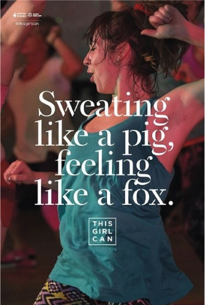
the 'this girl can' advert use quotes like 'sweating like a pig, feeling like a fox' which means sweating a-lot and feeling sexy. where as the nike quotes are about getting better and pushing yourself.
Friday 2nd February 2024
Do now:
How does this advert target a wider range of women than just the 'This Girl Can' print poster?
this advert targets a wider range of women than just the 'this girl can' print poster because in the advert there was women with disabilities, different ages and also different ethnicity. it also shows that all women can do anything.
Advertising set text no.2
L/O: To analyse the construction of the 'This Girl Can' set text
Sweat - body cool down, exercise
Pig - muddy, farming produce, barrow shaped
Foxes - sly, cunning
one is negative and the second flips the negativity on its head and makes it a positive
'sweating like a pig feeling like a fox.' they used this phrase to flip it from negative to positive and to say that your sweating a lot but feeling great they could also use the quote to make people feel good about themselves
How would you describe the font style?
serif
its more feminine
the logo is san- serif still feminine its also easier to read
What connotations does it have?
- centered mid shot to show she's sweating and working hard
- Not a female celebrity- to show that she's a 'normal everyday person'
- Hair scraped back in a scruffy ponytail - she doesn't care what she looks like, she could have kids
- sweaty- shows she's working hard
- workout/active wear- allowing you to actively and freely move around during strenuous physical activity, a wide range of physical activities and exercises that train the whole body
- Eyes closed with a slight smile- she's having fun
- active position- trying to get women to be more active
- Other women in similar positions in the background - i think the other women in the back ground are less enthusiastic than the women in focus. older women, she's in a public gathering ( she's not alone)
similarities:
the 'z' shape
the colour palette (reds, blue)
serif and san-serif
differents:
ones drawn and the other is printed
the quality street is stereotyping women
there is no men in the "this girl can" adverts
in the quality street advert the man is in centre where as the 'this girl can' advert the woman is in centre
Tuesday 6th January 2024
do now:
- to inspire women to get active
- the results of this girl can:2.8 million women aged 14-40 were more active.
Representation & theory
L/O:To explore the representations in the set text and apply relevant Theory
Dominant Ideology:the beliefs and ideas shared by the majority of people in a particular group.
In the Uk the liberal-democratic idea remains the dominant normative ideological discourse and an important source of identity for most Uk citizens.
In Cornwall: The Cornish today are largely Wesleyan Methodist, although other denominations are represented among the population as well.
What is this dominant ideology and how do they seek to challenge it through their adverts?
To get women and girls moving, regardless of shape, size , and ability.
in just one year, this girl can inspired 2.8 million women to do more exercise: of whom 1.6 million have started exercising, and 12 million have increased their activity levels.
36.9% of men and 25.3% of women agree that they find sport/exercise enjoyable and satisfying
women's rights to vote campaign:
the organised suffrage movement began in 1866 when a number of prominent women's rights reformers gathered some 1,500 signatures on a petition to Parliament requesting the right to vote.
Emily Davidson:
Emily Wilding Davison (11 October 1872 – 8 June 1913) was an English suffragette who fought for votes for women in Britain in the early twentieth century. A member of the Women's social and Politcal Union (WSPU) and a militant fighter for her cause, she was arrested on nine occasions, went on hunger strike seven times and was force-fed on forty-nine occasions. She died after being hit by King George V's horse Anmer at the 1913 Derby when she walked onto the track during the race.
Nellie Bly: a star journalist by going undercover as a patient at a New York City mental health asylum in 1887
After 10 days, the asylum released Bly at The worlds behest.Her report, published October 9th, 1887and later in book form as Ten days in a Mad-house, caused a sensation, prompted the asylum to implement reforms, and brought her lasting fame.
Bly described cold baths, filthy living conditions, spoiled food, and physical abuse from caretakers. This exposé pressured Blackwell's asylum and other facilities to consider more humane treatment options for patients. In the early 1900s, the last asylum patients on Blackwell's Island were moved to other hospitals.
women played football when the men went to WW1
Women's football was huge during World War One, drawing crowds of 53,000 even after the war had ended. So why did it disappear so dramatically, asks Gemma Fay, captain of the Scottish national female football team. She had a shot so hard she once broke the arm of a professional male goalkeeper.
1. the women in the picture has a enjoyable, happy facial expression showing that she's enjoying the sport she's doing giving a positive feeling about sport for the female audience
2. This advert seeks to encourage women to see themselves in the model they have chosen because this women isn't a celebrity she's a everyday women you would see in society.
I Don't think the title of the campaign (this girl can) is successful at being inclusive because its more focusing on inspiring women to be more active and not men as well.
the Villain: Biff Tannen
The Donor: Dr Emmet Brown
Hero: Quality street tin
The villain: the women
The donor: the man in the suit
she's the hero because she's the key person in the advert.
Women have been represented in the "this girl can' print advertisement as confident this is shown by the facial expression and the position the women is in, the women has a happy, enjoyful facial expression
Friday 9th February 2024
DO now:
confidence
encouraging
inspiring
sweat
Friday 9th February 2024
C1 section A PPE
L/O: to practise how to answer exam style Questions Effectively
Question 1: This girl can
Explore how the print advertisement for this girl can uses media language to create meanings:
(a) text/ written language
The #ThisGirlCan is used in social media so people any shape, size, race and ability can use this to share their athletic ability to others who are relatable to inspire more women.
The font of ' sweating like a pig, feeling like a fox' is serif which represents a female font, 'sweat like a pig' means your sweating a lot and ' feeling like a fox' means attractiveness which shows that you can be very sweaty but feeling attractive it shouldn't matter what you look like whiles making out its how you feel that counts.
(b) visual codes (for example: images, lighting, dress)
The campaign 'This Girl Can' inspires women ages 14 and over to do more exercise no matter what age, race, size or shape
The top that the women is wearing is blue which could be challenging stereotypes as blue is stereotypically a male colour she is also got a messy bun which could show that she doesn't care what other people think about her.Also the background is blurred out which could also show that she doesn't care about what others think. The women has her eyes closed which means she's in the moment she's also has a positive facial expression which means she is enjoying herself.
In the colour palette there is pink in the top half of her face this could show that she's sweating a lot.
Wednesday 21st February 2024
C1 Section A PPE
L/O: to revise how to answer exam style questions Effectively
Describe: The meaning constructed Explain: support with specific evidence- how has media language been used to construct this meaning (connotations)
link:to the overall context/meaning
Question 2a: Explain how political contexts influence magazines. Refer to pride magazine to support your points
Friday 23rd February 2024Do now:
warner bros
paramont
disney


Good notes on aims and conventions
ReplyDeleteQS ADVERT:
ReplyDeleteGood notes and understanding of context, the use of ML & representation
QS HOMEWORK:
Not completed
THIS GIRL CAN ADVERT:
Good notes and understanding of context, the use of ML & representation.
PPE Q1a: 2/5
WWW: Two clear points made
EBI - use the DEL structure to make sure you explain any connotations and link it to the overall message
PPE Q1b:5/10
WWW: some focus on the meanings constructed by the visual codes
EBI: make sure you include any connotations and link the points to the meaning/purpose of the campaign by using the DEL structure for EACH POINT